TYPE
SPECIMEN
2024.
STUDENT WORK
When spreading a message, choosing the right font is one of the most important steps. Fonts unconsciously affect the audience’s perception depending on what they look like and how they are used in a historical context. Before purchasing the license to use a font, designers often want to see a range of included features, leading to the need for a type specimen.
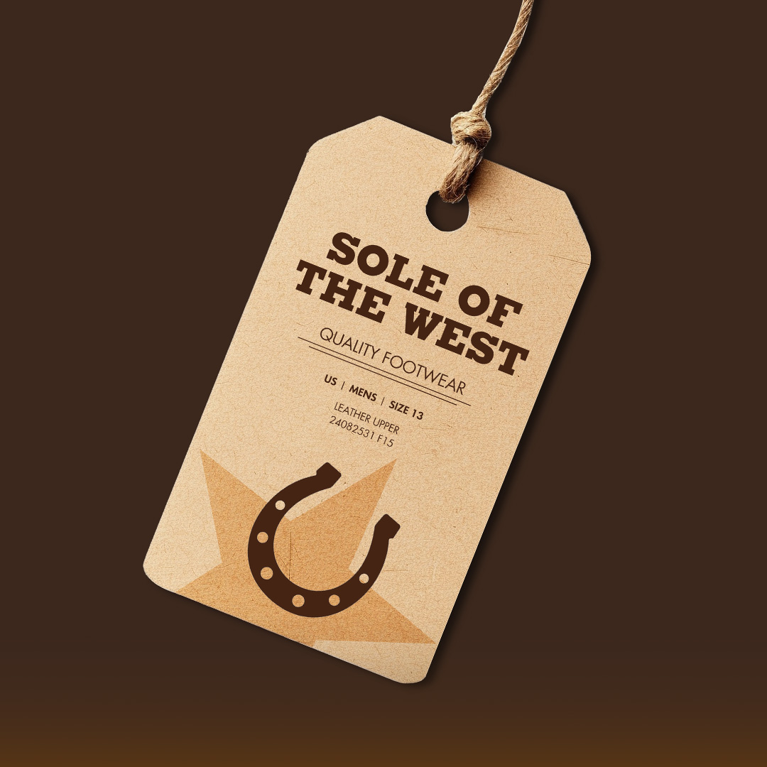
While my focus was on the Architype Renner version of Futura, I analyzed different font foundries, comparing the technical variations between the characters and paragraph setting. In addition to showcasing Futura’s glyphs and special marks, I then created three mockups showcasing potential pairings between Futura and other fonts.

FOUNDRY COMPARISON
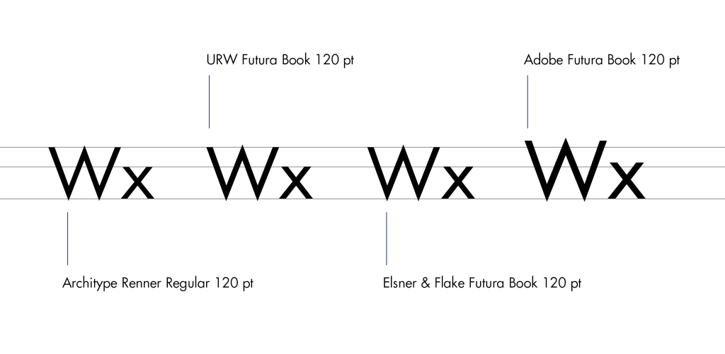
While the original Futura typeface was created by typographer Paul Renner in Frankfurt, Germany, the font was a popular embodiment of Bauhaus design and subject to many other foundries creating their own versions. This type specimen compares the original Architype Renner Futura with URW Futura, Elsner & Flake Futura, and Adobe Futura.
SKETCHES
After analyzing Futura’s qualities, I paired it with other fonts using different methods comparing and contrasting their features. I created three designs for fictional logos utilizing these font pairings, effectively showing the versatility of Futura.

MOCKUPS
My final type specimen extensively compares the four previously mentioned Futura foundries down to the weight of the letters, providing an in-depth analysis of the differences between them. The type specimen also showcases Futura’s special characters and features one can use after purchasing the license. The full Architype Renner Futura type specimen can be viewed below.